So you want to design an app? But you don’t know how? Here’s a handy guide to help you bring your idea to life.
When building mobile applications, our first thoughts are usually about code; what language will I use? what framework? etc.
This is not the ideal way to approach app development. The best app idea in the world will struggle to get traction if the user experience is poor. Overlooking the design can also end up being costly if we’re forced to make changes later on in the development process. In this article, you’ll learn how to take your app from an initial idea all the way to beautiful mock-ups.
- User Journey
The first step when you have an idea is to flush out your user journey. This is the step-by-step journey the user takes to reach their goal. We can do this by creating a user flow diagram such as the one below.
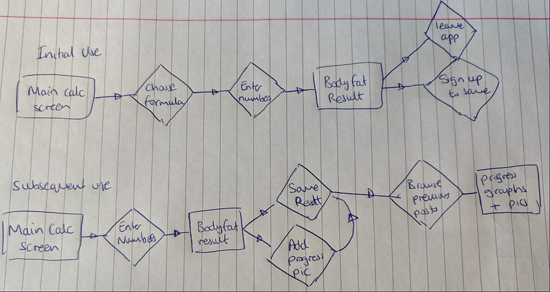
Rectangles represent a screen the user sees, diamonds represent a decision the user must make. Simple!
I recommend pen and paper but there are some great free tools to help you create digital user flow diagrams. They are FlowMapp and Miro.
If you’ve never thought about user journeys before, you may need some inspiration. Have a look at your favourite apps and see how they handle the user journey. Pttrns has thousands of curated mobile design patterns. Remember, good designers borrow, great designers steal!
2. Wireframes
Once you have a clear user journey, it’s time to create some wireframes to get a basic idea of how each screen will look. Again, you can easily do this by hand, just print some iPhone/iPad templates from UIStencils.
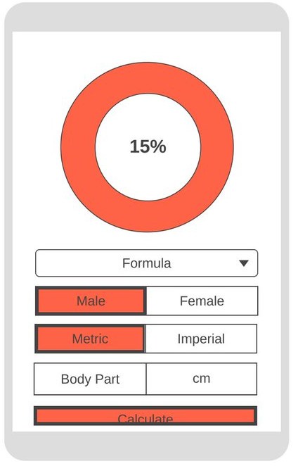
I created wireframes for my app using this wireframecc. It’s not pretty (yet), but it’s not supposed to be. If you’re looking for something with a few more features and don’t mind the slightly higher learning curve, try MockFlow.
3. Color Palette
One of the most important aspects of design is your colour palette. Colours give meaning to design, they can spur emotions and express values. Some have universal significance, eg: it is commonly understood that red is a warning colour and green means go.
Before choosing your colour palette, it’s a good idea to understand some basic colour theory to help guide your choice. Here is a good resource: Colormatters.
I use ColorHunt to find colour palettes. It has a collection of curated palettes created by professional designers. Here is what I picked for my app. The black will be used for most pages to fit the “dark mode” aesthetic which is currently very popular. The blue is energetic and vibrant, perfect for an app related to working out.

4. Mock-Ups
The final phase of app design is creating some realistic mock-ups. These will be used for guiding development and are also great for marketing if you want to build up hype for your application before it’s complete. This is the most challenging and time-consuming part of the process so choosing the correct tool is crucial.
At one end of the spectrum, we have Photoshop which is probably the most powerful and versatile tool a designer can use. But with great power comes a massive learning curve! Not to mention the cost (around $20/month). I recommend photoshop only if you already have prior experience with the software or if you really need your mock-ups to look amazing for marketing.
At the opposite end is Canva which is more of a poster/presentation design tool. The feature set is slightly limited but you can still create realistic mock-ups with some creativity. The advantages are: it’s completely free for individuals and takes very little time to learn.
My favourite tool is Figma. Here is why:
- It’s completely free for individuals
- It’s packed with features specifically for application design
- It’s very easy to use collaboratively
- The learning curve is not too steep
- There’s a great community which can help guide your design
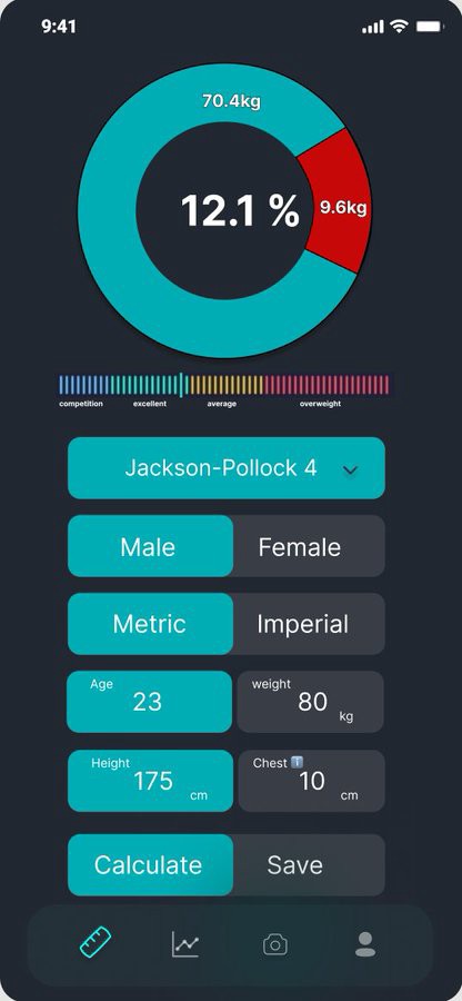
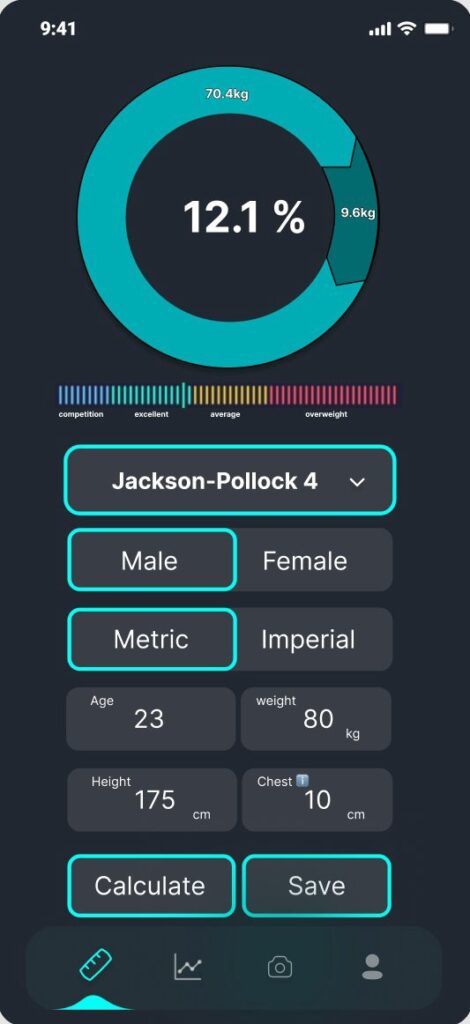
Once you have your first draft, it’s easy to iterate and improve your design until you’re happy with it. You can see my first draft (right) is very similar to the wireframe. The blue colour seemed a bit over-used so I decided to tone it down in the following iterations. At this stage, you can ask others for feedback to help you really narrow down the final look and feel of your app.
Now you have all the tools you need to create your masterpiece. Happy designing!